Clean, purposeful, and brand-forward—your design style blends clarity with impact, using bold type, thoughtful color, and real-world imagery to connect message with mission.
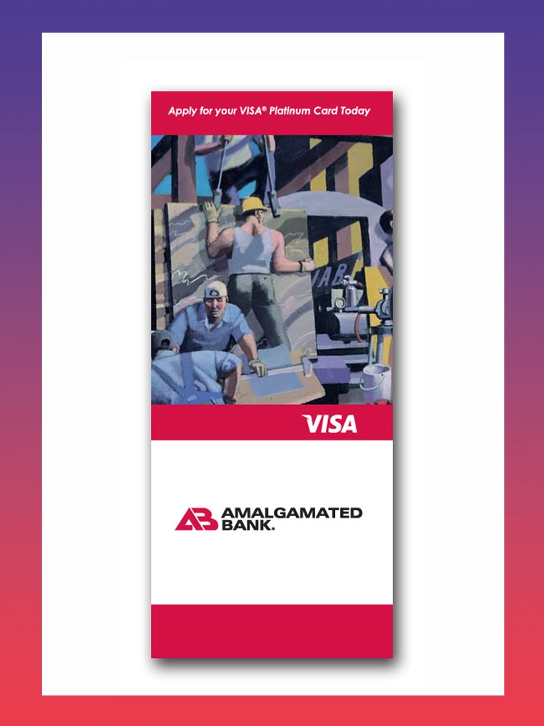
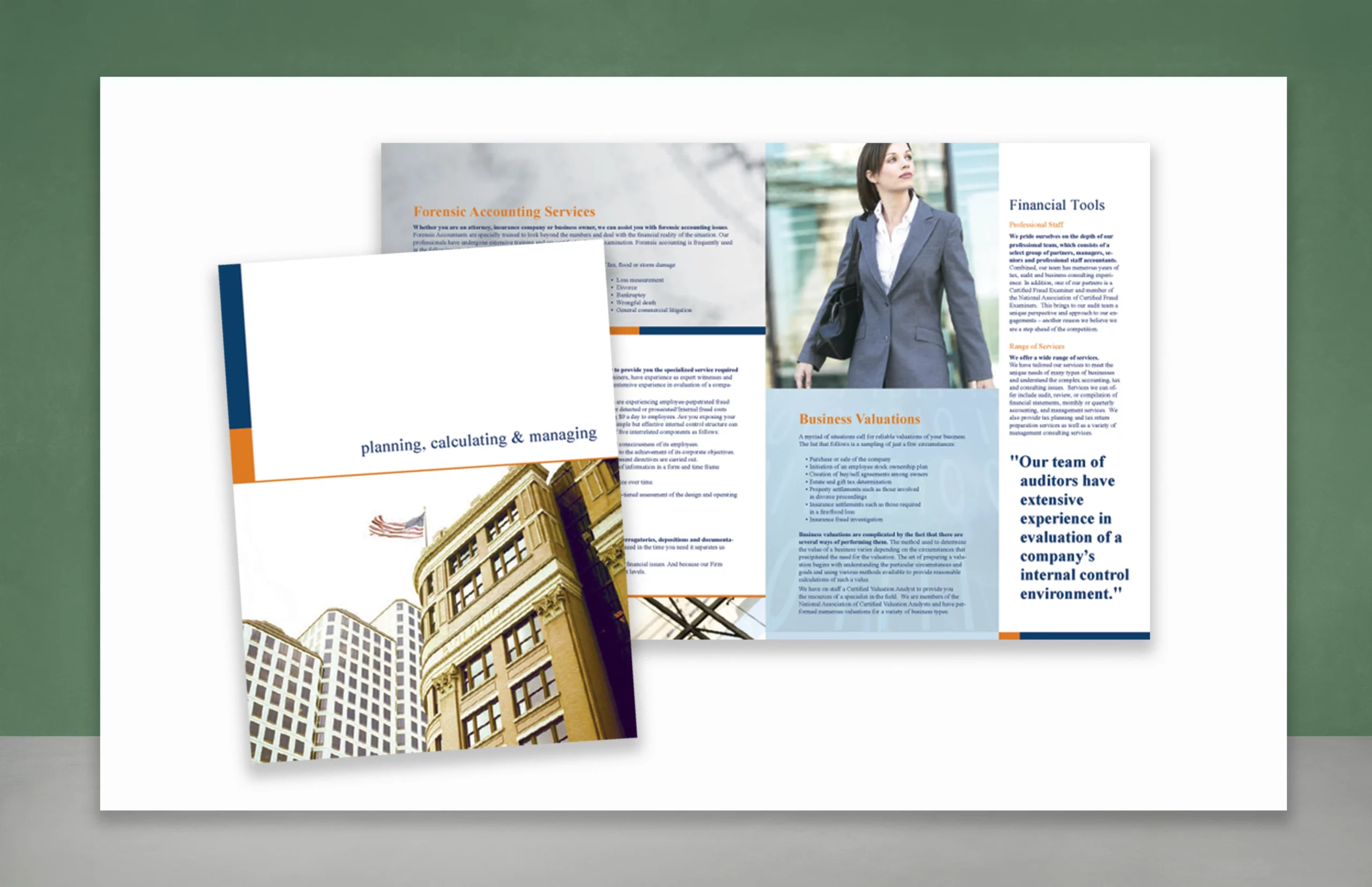
This professional brochure design positions a financial services firm as both trustworthy and forward-thinking. The clean layout uses structured columns, crisp typography, and confident imagery to convey expertise in areas like forensic accounting, business valuation, and financial tools. Strategic pops of orange and navy add visual hierarchy and reinforce the brand’s authority. The cover’s architectural photography hints at stability and scale, while the interior spreads balance technical content with approachable visuals—perfect for instilling client confidence in high-stakes financial decisions.
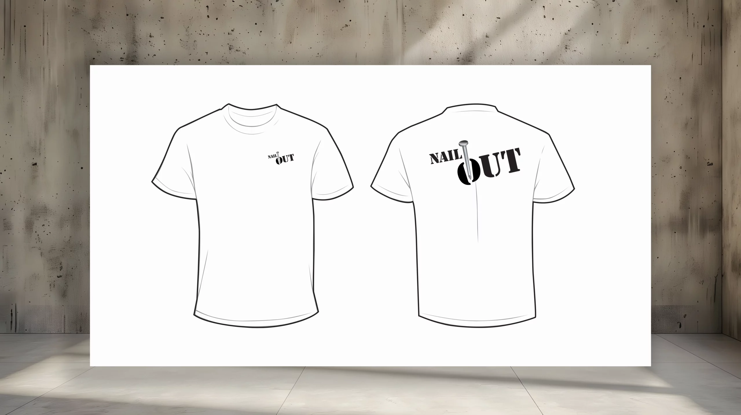
Product Brand + T-shirt Design
This t-shirt and logo design for Nail Out captures the rugged simplicity of the product—a tool designed to remove nails with ease. The graphic uses a strong, industrial typeface with a nail icon cleverly integrated into the letter “O,” reinforcing the core function of the device. The shirt layout keeps things minimal but punchy, with the logo on the front chest and a larger, high-impact version across the back. It’s a no-nonsense visual identity that speaks directly to contractors, builders, and DIYers alike.
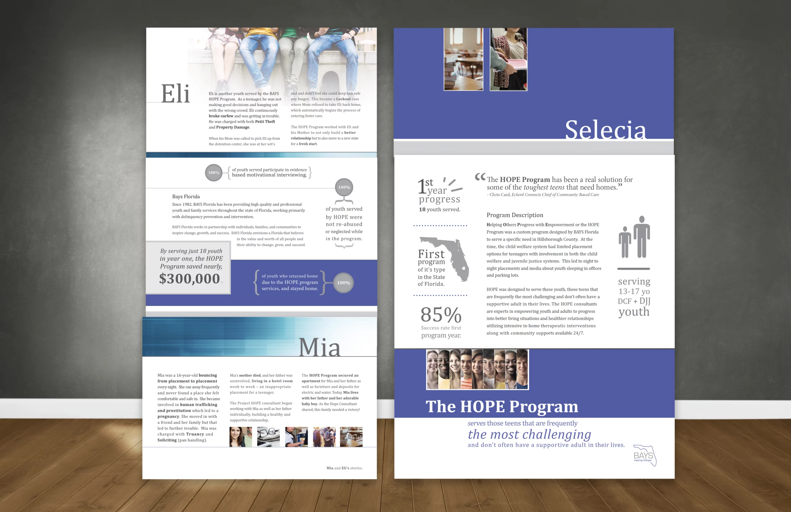
Outlining Success Brochure
This layered brochure set for The HOPE Program is designed to humanize data and amplify impact through personal stories, clean infographics, and structured layouts. Each panel highlights a youth’s journey—like Eli, Selecia, and Mia—pairing real-world outcomes with clear statistics to show the program’s success in serving at-risk teens. A calming palette of blues and neutrals conveys trust and stability, while bold typographic pulls and geographic visuals emphasize scale and relevance within Florida. The result is an emotionally resonant, data-driven advocacy tool built to inspire support and understanding.
Made with 🩷 in St. Petersburg, Florida. Where we hold the world record for most consecutive days of sunshine—768 of them!
We’re a city where murals bloom on every corner, pelicans have personality, and sunset feels like a local ritual.