Katherine's Creative Evolution
With a background in both agency and in-house settings, Katherine Worley has transformed countless ideas into stunning visuals. Her design philosophy emphasizes meaningful, strategic solutions that resonate with audiences and endure over time.

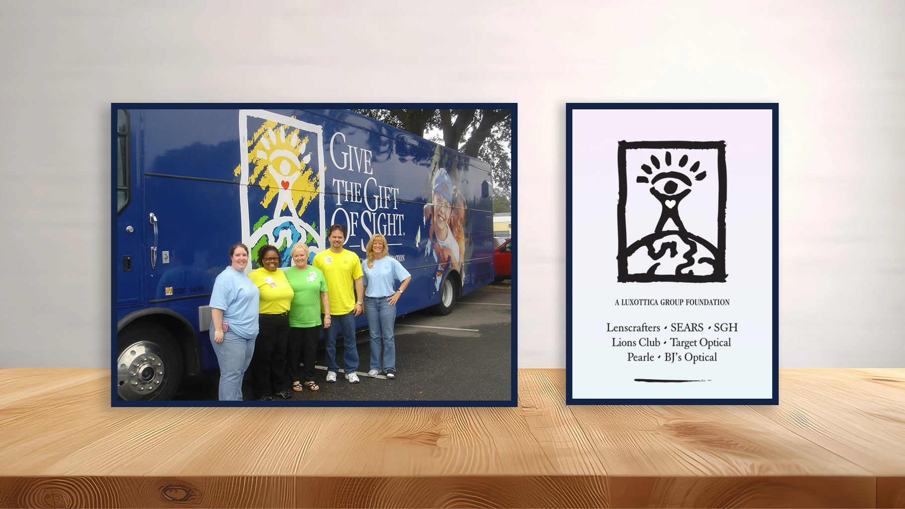
Vision, Luxottica of America
Design a vibrant and eye-catching t-shirt for the Gift of Sight Vision Van. The front of the shirt features a stylized graphic of an eye surrounded by colorful rays of light, symbolizing vision and clarity. Above the eye, include the bold text: ‘Gift of Sight’ in an inspiring font. On the back, add a graphic of the vision van with a tagline: ‘Bringing Clarity to Life’ in a playful font. Use a color palette of blues and yellows to evoke positivity and hope. Ensure that the design is suitable for a variety of sizes and appeals to both adults and children, promoting awareness of vision care initiatives.
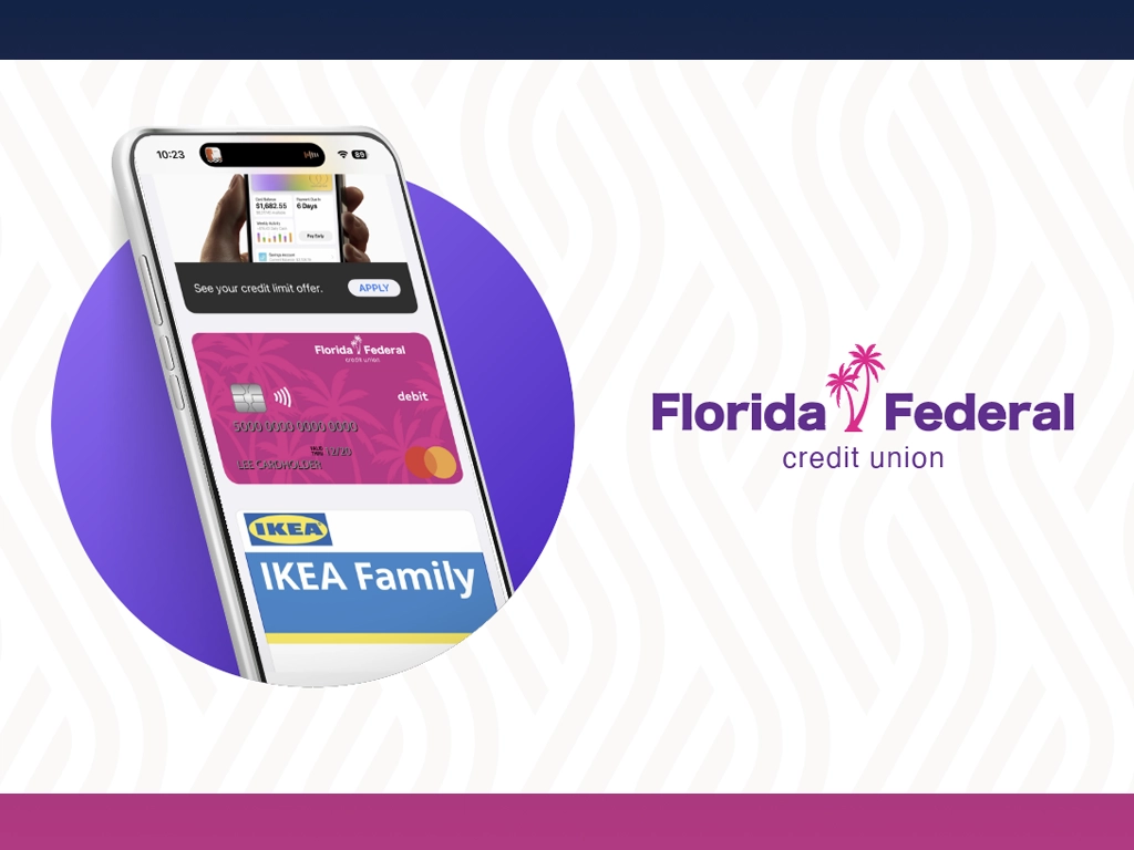
Optimistic Florida Vibe
This design showcases a bold, modern identity for Florida Federal Credit Union, combining vibrant magenta tones with clean sans-serif typography and playful palm tree imagery. The digital wallet integration emphasizes convenience and tech-forward accessibility, while the debit card’s tropical pattern reinforces a sunny, optimistic Florida vibe. Together, the design elements reflect a fresh, contemporary take on financial branding—geared toward digitally savvy members who still value local character.
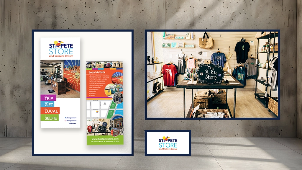
Local Charm of St. Petersburg
This vibrant rack card captures the creative, local charm of The St. Pete Store and Visitors Center in St. Petersburg, FL. With bold colors, playful typography, and inviting imagery, it highlights the store’s role as a hub for local art, handcrafted goods, and visitor info. Catchy calls to action like “Plan a Trip” and “Support a Local” pair with a photo collage and map to showcase the shop’s offerings and location. It’s a quick, colorful pitch for travelers looking to experience the authentic spirit of St. Pete.
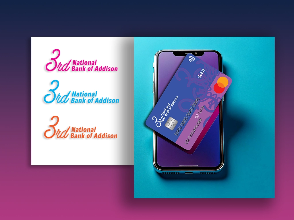
3rd National Branding & Identity
This bold, modern design for 3rd National Bank of Addison reimagines traditional banking aesthetics with vibrant color gradients and elegant typography. The logo explorations balance classic script with contemporary flair, while the debit card design pairs electric purples and pinks with a subtle ornamental graphic for a sense of movement and energy. Positioned against a sleek mobile device, the visual emphasizes digital-forward banking without losing the personal, boutique feel. It’s a standout look built for a brand ready to defy expectations.